The 2026 Color of the Year is...White?

PANTONE 11-4201 Cloud Dancer
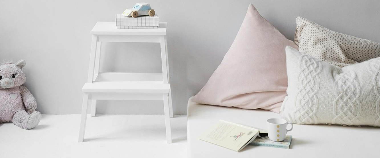
Pantone named Cloud Dancer as the 2026 Color of the Year, and at first glance, it feels almost… anticlimactic. It’s white. Or close to it. But the more you look at the palettes Pantone shared in their announcement, the more intentional it feels. At least to me it does.
(You can see those palettes here: https://www.pantone.com/hk/en/color-of-the-year/2026?srsltid=AfmBOoo3heN1cI8xfosH-SlUCzYn7AEjl44b6rHyGy3YsQi6xX1Rdzks)
Over the last several years, there’s been a strong push away from “millennial grey.” Designers and homeowners alike were ready for something new. That shift, however, swung hard in the opposite direction. Deep jewel tones, saturated colors, and bold statements everywhere. For some, it worked beautifully. For others, it felt overwhelming and visually exhausting.
Cloud Dancer feels like a recalibration.
The palettes Pantone paired with this color show subtle color. Soft blues, gentle greens, warm undertones. It’s a reminder that neutrality and color don’t have to be at odds. You can have both. You can bring color back into your space without committing to something that feels loud or permanent.
White itself is deceptively complex. If you’ve never had the experience of putting 17 different white paint samples on a wall only to watch some turn pink, some turn yellow, some turn grey, and suddenly nothing looks white anymore… just wait. It’s coming.
That’s where Cloud Dancer stands out. It presents as a true neutral white, without a strong undertone pulling it warm or cool. From a design standpoint, that neutrality creates freedom. It allows surrounding materials, finishes, and colors to take the lead rather than competing with them.
And from a practical perspective, white works with everything. Warm woods, cool stones, metals, bold textiles, soft layers. It adapts. It supports. It doesn’t ask for attention.
There’s also something kind of poetic about white being the Color of the Year. If you Google “what is white,” you’ll find that White is often defined as the presence of all colors in light, while being the absence of pigment. In that sense, choosing white as the Color of the Year reinforces the broader idea behind these palettes. This isn’t about removing color from our homes. It’s about reintroducing it thoughtfully, in a way that feels livable and flexible.
Which leads to one of life's true questions: Do you actually have to paint your walls something other than white to have a well-designed space?
I don’t think so. There is absolutely nothing wrong with white walls. You can create a curated, intentional space entirely through furniture, materials, texture, and decor. Sometimes white walls elevate a space even more. Painting a wall can add interest, but it can also distract from the design if it’s not serving a purpose.
White isn’t a lack of design. It’s a foundation.
So I’m curious what you think. Do you like having all white walls, or do you prefer to add color?